
UI/UX Design That Makes Sense to Your Users
Good design isn't about making things pretty—it's about making things work. If users can't figure out your interface in seconds, you've already lost them.
We design based on how people actually behave, not how we wish they'd behave. Our portfolio includes apps with millions of active users, enterprise dashboards handling messy data, mobile apps averaging 4.8+ stars, and online stores where people actually complete checkout.

Bad UX is expensive. People give up, call support, or just leave. Good UX feels invisible—things work the way users expect.
User Experience (UX) Design
- How we approach UX:
User research comes first. We talk to real users before touching design tools. What are they trying to do? Where do they struggle? What do competitors miss? You'd be surprised how often the answer isn't what stakeholders assume.
User personas keep everyone honest. Instead of designing for 'everyone,' we design for Sarah who checks metrics between meetings, or Robert who needs to export detailed reports every Monday. Specific people, specific needs.
User journey mapping shows the full picture. Someone discovers your product → signs up → learns the basics → becomes a regular user. Where do they drop off? We map it all out and fix the weak points.
Information architecture is just a fancy term for 'putting stuff where people look for it.' Your main navigation shouldn't require a treasure map.
Here's what this looks like in practice: A SaaS company's users kept complaining they couldn't find features. We tracked what people actually clicked, reorganized the navigation around real behavior, and support tickets about 'where's the X button' dropped by 75%.

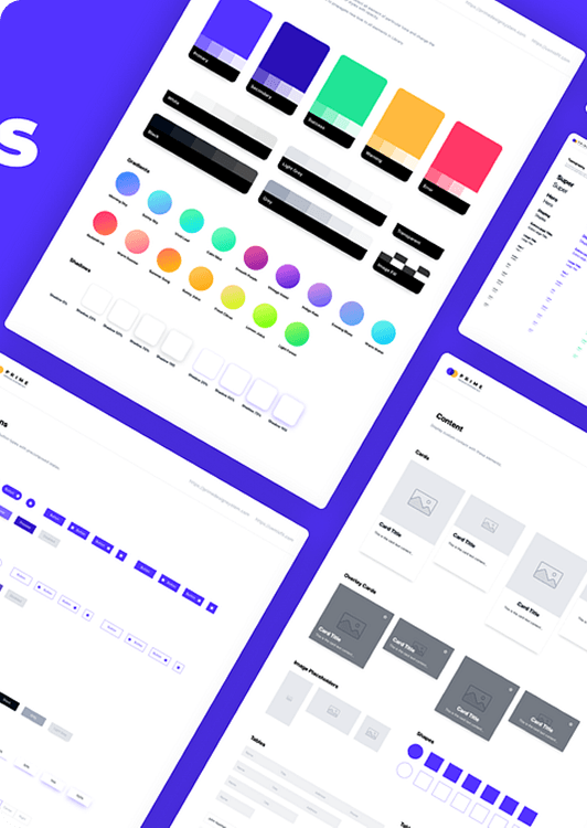
Once you're designing more than a handful of screens, you need a system. Otherwise, every designer invents their own button styles and nothing looks consistent.
Design Systems & Style Guides
- What goes in a design system:
Colors:
Primary, secondary, accent. Error red, success green, warning yellow. Background shades, text colors, borders. All the hex codes documented so nobody's guessing.
Typography:
Font choices, sizes, weights. H1 through H6 styles. Body text, small print, labels. Specified down to the line height.
Components:
Every button state—regular, hover, clicked, disabled. Form fields, dropdowns, checkboxes, radio buttons. Cards, pop-ups, tooltips, alerts. Build it once, use it everywhere.
Spacing:
A consistent scale (usually 8px, 16px, 24px, 32px) so padding and margins aren't random numbers.
Why bother?
New features ship faster because you're not redesigning buttons every time. Everything looks like it belongs together. New team members don't reinvent the wheel.
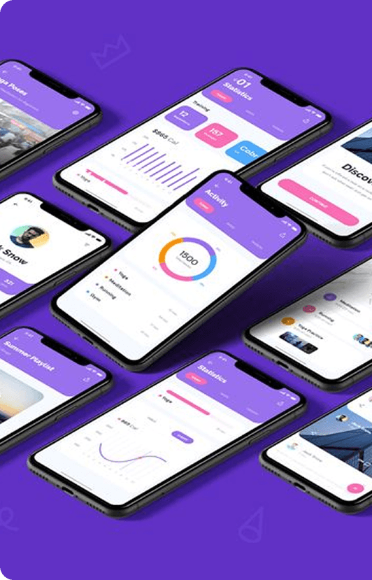
Mobile isn't just 'small web.' Different screen sizes, touch instead of clicks, platform expectations users already have.
Mobile App UI/UX Design
Platform-specific design:
iOS users expect certain patterns from Apple's guidelines. Android users expect Material Design conventions. We respect both while keeping your brand recognizable.
Touch-friendly targets:
Buttons need to be big enough for thumbs—44x44 pixels minimum on iOS, 48x48 on Android. Space them so people don't tap the wrong thing.
Familiar gestures:
Swipe to delete, pull down to refresh, long-press for options. Don't invent new gestures when existing ones work fine.
Screen flexibility:
Your app needs to work on a tiny iPhone SE and a massive Android tablet. Content should adapt, not break..
Web apps often juggle complicated data and multi-step processes. The challenge is keeping it simple enough that people don't need training.
Web Application UI/UX Design
Dashboard layouts:
Show the important stuff immediately. Let users drill into details when they want more. Filters, date pickers, and export buttons should be obvious.
Data visualization:
Pick charts that actually help. Line graphs for trends over time. Bar charts for comparing categories. Pie charts sparingly (they're harder to read than people think). Make the numbers tell a story.
Complex processes:
Break long workflows into smaller steps. Show progress bars so people know where they are. Auto-save so nobody loses work.
Responsive everywhere:
Tables work great on desktop but turn into scrolling messes on phones. We adapt layouts—tables become stacked cards, sidebars collapse into menus.
Better UX in e-commerce literally means more money. Every friction point costs you sales.
E-commerce UI/UX Design
Product pages that convert:
Big, zoomable images. Clear pricing and stock status. Shipping info up front. Size charts, specs, and reviews where people look for them.
Shopping cart clarity:
Easy to change quantities, delete items, add promo codes. Show the full total—including tax and shipping—before checkout starts.
Streamlined checkout:
Fewer steps mean more completed purchases. Offer guest checkout. Use address autocomplete. Accept multiple payment methods. When something goes wrong, explain it clearly.
Real example: We trimmed a client's checkout from 5 steps down to 3 and removed forced account creation. Conversion rate jumped 23%.

Accessible design helps everyone, not just people with disabilities.
Accessibility Design
WCAG standards:
Proper color contrast so text is readable. Full keyboard navigation for people who can't use a mouse. Screen reader support. Descriptive alt text for images.
Universal benefits:
Captions help when you're in a noisy coffee shop. Good contrast helps in bright sunlight. Clear navigation helps everyone find things faster.
We test with accessibility tools during design, not after launch. Automated scans catch technical problems. Manual testing with actual screen readers catches usability issues.

Why Work With RamScript
User-first thinking:
We design around research and real behavior, not gut feelings or what looks cool.
Evidence-based:
A/B tests, analytics, and usability studies drive decisions. Data beats opinions.
Platform knowledge:
We know iOS, Android, and web conventions inside out. Your design will feel native, not awkward.
Collaborative process:
Regular check-ins, iterative refinements, and your feedback matter at every stage.